If you read our blog, you know branding is one of our favorite topics to explore. We’ve talked about long-term branding, personal branding, and even how to brand with product packaging. We do a lot of talking, so today we want to change it up and show you two examples of some of our favorite brands. Keep in mind, branding is more than just a logo and the way a website is designed. People buy products not for what they do, but for what they mean. Let’s begin!
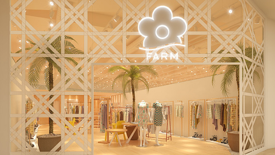
Farm Rio is a Brazilian clothing company which just recently announced that they are opening stores in the USA come March 2019 (YAY!). Why are they on our branding radar? Because everything they do is consistent, on-brand, and just so darn cute. If we were to sum Farm Rio’s brand in a sentence, it’d be laid-back, effortlessly chic, sun-kissed Rio babe. Talk about aspirational self-image.
Walk into any Farm Rio store and you’ll immediately feel like you’re at some exclusive beach resort lounge. Everything from their music, to the decoration, and the customer service sets this vibe. The best part, no two stores are identical. Each location will leave you with a unique experience that’ll make you glad you walked in.
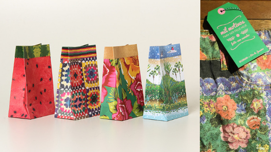
For Farm Rio, it is summer all year long. This company is not afraid to play with prints and colors and this is seen in their packaging. Every item purchased comes with a tag with positive sayings like “A million reasons to be happy today”, wrapped in fun tissue paper, and placed in a printed velcro paper bag like the ones shown above. The brand experience follows you up until you go home and unwrap your purchases.
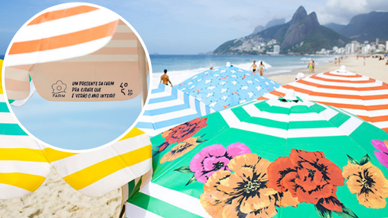
When Rio de Janeiro turned 450 years old back in 2015, what did Farm Rio do for their beloved city? They gifted umbrellas with their signature prints. All summer long the beaches of Ipanema were decorated with these beauties which not only shaded a lot of beachgoers from the hot sun but also increased their brand awareness as their logo was on each umbrella. This marketing tactic further enhanced Farm Rio’s brand persona and left customers with a branding experience.
Erin Condren is a stationery company that primarily focuses on planners, journals, and organizers. What sets them apart from their competitors. We’ll argue that it’s their branding! When you buy an Erin Condren planner, you’re not just buying the tangible product… you’re buying the feeling of everything in your life falling into place. When we say people buy products for what they mean, this is what we’re talking about.
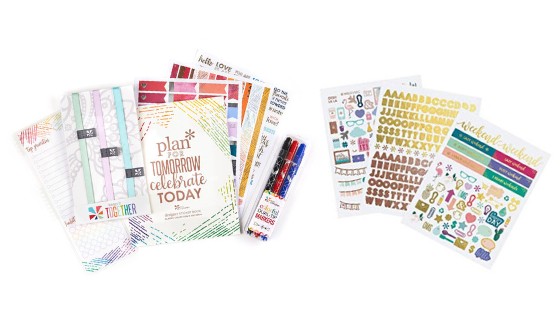
Receiving an Erin Condren planner in the mail is an experience, to say the least. The best part? The surprise goodies they throw in as an extra for you. Sometimes they’ll throw in stickers for you to add to your planner, other times its greeting cards, or to & from mailing labels. Why is this branding genius? Because it makes you, the consumer, feel special and attribute a positive feeling with their brand. Hmmm, hello brand loyalty.
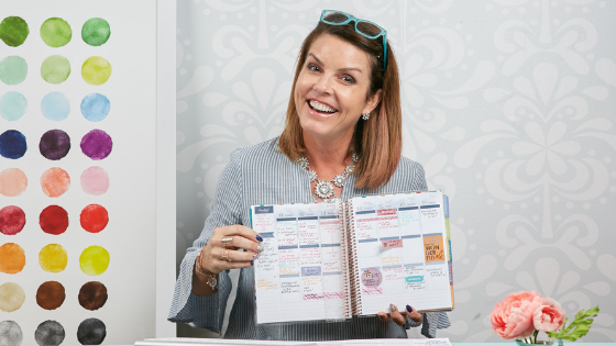
The Erin Condren brand also does super well because it’s representative of who else but its founder, Erin Condren. She represents the #girlboss lifestyle and the building of her empire is something a lot of women who buy planners aspire to be like. It’s not only the fact the company is named after her, but her voice shines through on their website, social media account, etc. She gives the brand a voice by being the force that’s leading girls across the country to live a more organized life.
We hope these two brands give you some inspiration for your business. The takeaway from both of these companies is that they build positive experiences for their customers which enhances the way their brand is portrayed. If you need help getting started on a brand or are rebranding, please get in touch with us, we’d love to help!
Now tell us in the comment section below, what are your favorite brands?





Leave a Reply
Want to join the discussion?Feel free to contribute!