
Achieving Simplicity While Designing

Making something simple is oftentimes harder work than making something complex. It’s easy to keep adding elements, but incredibly tough to eliminate. The reason being that we don’t want to risk eliminating the wrong thing or because we feel guilty putting in all these hours of brainpower only to click delete. As hard as it may be, it is absolutely necessary in the world of content creation. Whether you’re creating a new website banner, a social media post, or a graphic for a newsletter, simplicity is key to getting your message across.
A big misconception is that simplicity means that your work needs to be white/black or boring. That couldn’t be further from the truth. Achieving simplicity is about eliminating the elements that distract from the goal (see Tip #1). With that being said here are 4 tips on how to achieve simplicity while designing content:
Tip #1: Pick A Goal
Before you even open up the software or program you use to create content, put into words what the goal of this piece of content is. Is the goal to direct your audience on Facebook to your website? Is it to get lots of “shares” on Instagram and thus increase brand awareness? Whatever the goal is, write or type it out because this will be the foundation of your design.
Tip #2: No More Than Two Fonts
Fonts are very fun to play with and it is tempting to throw every font we like into a design…let’s stop doing that though. If you are a brand, you should have a “Brand Asset” document that highlights your company’s official logo, colors, fonts. If that is something you have, obviously stick to your company’s official font to make sure your work is on brand. If that’s something you don’t have because maybe you are just getting started or designing content for an event or something not correlated to a brand, our recommendation is to use no more than two fonts per piece of content. If there are more than two, your work will immediately look busy and hard to read, which will detract from your goal.

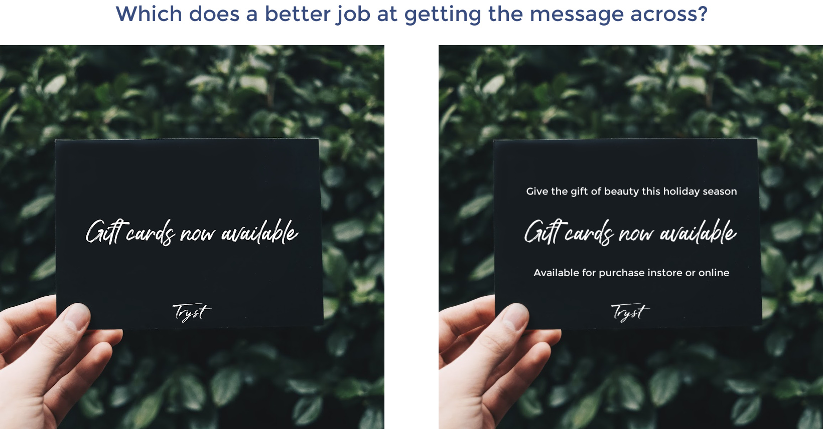
Tip #3: Keep The Text Light But Focused
In the process of creating content, a lot of ideas come to mind when copy writing and we are strong supporters of putting the ones that make sense into your work. Do this until there is no more text that comes to mind. Next step: trim, trim, trim. If someone is scrolling, no one will stop to read a novel. Instead, focus on the text that grabs your audience’s attention (the hook) and the call to action (shop now, learn more, logo, or website URL). If absolutely necessary, you can add more as long as it will help your audience reach the goal you set forth in the beginning of the process.
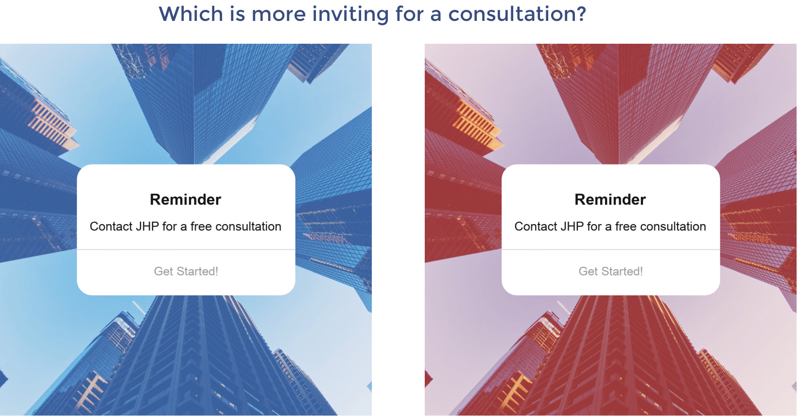
Tip #4: Color Palette Is Key
Think of color as context to the tone of the content you are putting out there. Each color has a voice and if you choose a color that doesn’t fit with the tone of your message, it can oftentimes drown the audience from grasping said message. Again, if you have an official company color(s), stick to that to stay on brand. If you don’t, choose colors that complement each other and don’t clash. Coolors is a website that will help you generate a beautiful color palette if you are starting from scratch. Refer to the example below so you visually understand the importance of choosing a color that fits the tone.
With all that being said, we hope we’ve inspired you to go and create something beautiful for your brand. Utilize these four tips each time you create content and you will achieve simplicity while designing. If you have a design project in mind or would like to inquire with us about our content creation services, please visit our contact page to reach out via email or phone.
