These days, it’s simply not enough to just sell a good product…the packaging it comes in matters as well. In a world of various competing products, consumers tend to pick the one that provides the best sensory experience. Packaging, after all, is an extension of your brand, and as we’ve preached before, the brands we choose make a lifestyle statement about the type of people we are or wish we were. People buy products not for what they do, but for what they mean, and believe it or not, packaging influences our feelings about the content inside the package, for better or worse.
Good Packaging Defined
Good packaging has two elements: functional and emotional. The functional is based on protecting the product inside and ensuring that all its components are intact for purchase. The emotional, however, is the visual presentation it delivers to the customer. This element is crucial for your business’ branding. Does your packaging come off as fun, quirky, sophisticated? When the visual element of packaging is executed well, it tells a story. It builds a sensory experience that provides hedonic value to the consumer and thus, builds brand loyalty. This is called the self-concept attachment, meaning that the products we purchase help to establish our identity.
Designing Your Business’ Packaging
Now that you understand the importance of good packaging, you’re probably wondering how you can achieve it for your business. While there is no magic formula, we do have some branding tips for you to reference when planning the design of your packaging:
1. Define Your Brand Vision
Think about how you want your product’s brand to be understood by your customers. Define your mission, brand personality, internal values, etc. and consult it whenever you need to make an on-brand decision.
2. Use Your Brand Assets
Your brand assets are your logos, brand colors, slogan, tagline, causes you support, the list goes on. Organize your brand assets and decide which are worth featuring on your packaging.
3. Positioning Your Brand
Think about your messaging. Not just the text of your message but also the tone it portrays. Does it match your brand vision? Make sure you keep in mind who you are talking to as well.
After you’ve thought about the three branding factors above, you’ll have a direction to base the functional and emotional design of your packaging. We at Cobalt & Sapphire specialize in helping businesses define their brand so that customers can build an emotional attachment to it.
Now, to end this post, we will showcase images of some of our favorite product packaging to help get your creative juices flowing. Tell us in the comment section which is your favorite!
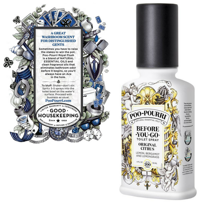
Poo-Pourri
Poo-Pourri took something taboo, like going #2, and made it into a beautiful bottle that has lots of intricate details to read and look at while you go! The bottle almost looks like a renaissance work of art. The juxtaposition of poop and being fancy is brilliant!
Trident
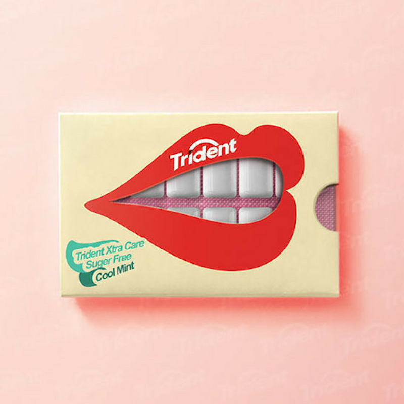
Trident used the product’s appearance as part of the visual design of the packaging. It is fun, clever, and in sync with pop culture as the lips remind us of Rolling Stones Iconic logo.
Glossier
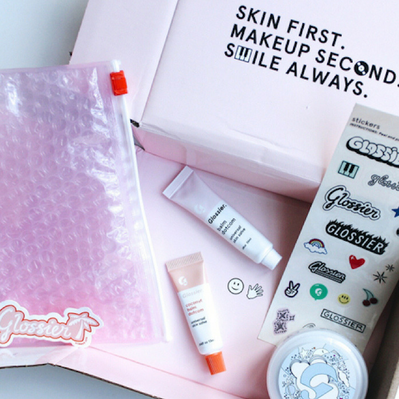
Glossier pulls on women’s nostalgia of being a little girl playing with makeup when they add these fun, almost retro stickers in their box. It adds a hint of quirkiness to their clean, sophisticated product.
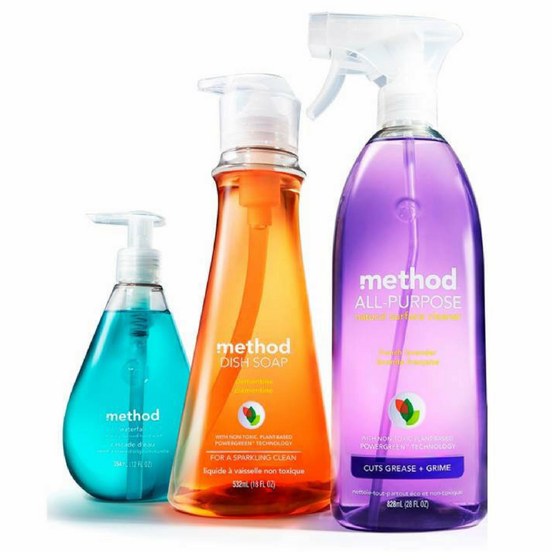
Method
Method takes something as boring as cleaning products and makes it interesting to look at. So simple, so modern, and so different from all its competitors. They embody the “Less is More” mentality as they purposefully avoid a clutter of information on their bottles.


Leave a Reply
Want to join the discussion?Feel free to contribute!